Cart 0

CREATIVE PORTFOLIO

By Cameron Kuey

Since 2016, Cameron has been managing the 501(c)(3) Christian media non-profit organization, The Cultivation Project. Through this organization, Cameron and his team have provided video, graphics, and web services to over 50 churches and missionary teams around the globe. Cameron continues to do wedding photography and videography while managing The Cultivation Project.


Film Production

By Cameron Kuey

Short Documentary Video

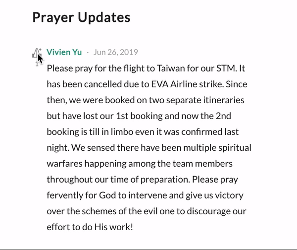
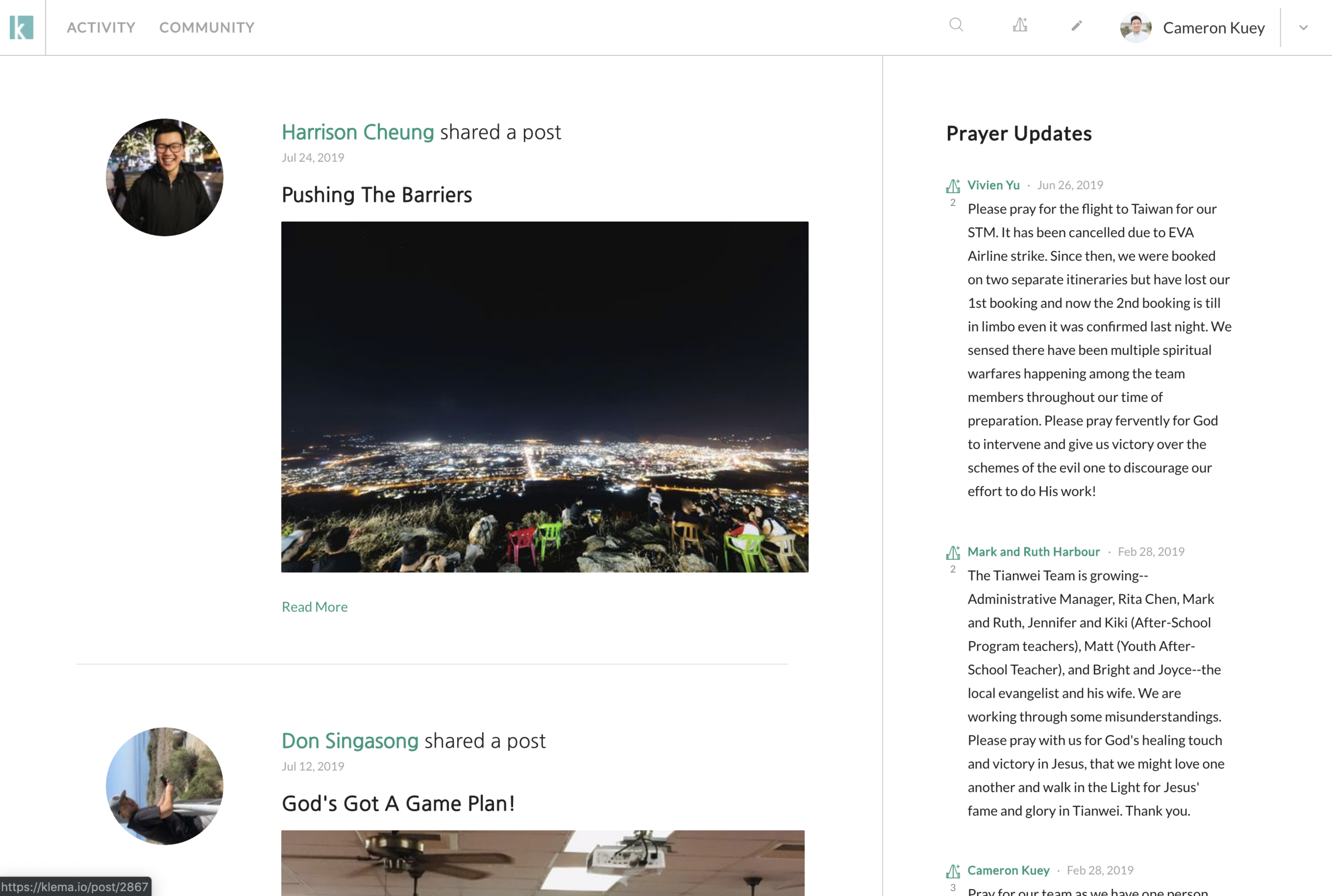
Directed by: Cameron Kuey

Produced by: Josephine Sheu & Chinese Evangelical Church

Filmed by: Cameron Kuey & Oscar Tsai

Edited by: Cameron Kuey

This video above was created to raise support and awareness for a missionary team in Taiwan. For this project, we had to go full documentary style and could only bring what we could fit in our carry-on sized bags. My team (Josephine & Oscar) and I visited Alex & Kristi Tan for 3 full days and documented their daily life as they ministered to the locals and ran their basketball and English classes. After the trip, I sorted through the dozens of hours of footage and went through the process of cutting it down to a 5 minute story, which premiered at my church to about 500 people. The missionaries then used this video for their own website and social media channels and have used it to expand their support base.


Wedding Highlights Video

Since 2012, I have both filmed and photographed over 40 weddings. For wedding videography, I usually bring a crew of 2-3 people total to film with multiple cameras. As part of my packages, I provide a wedding highlights video and a wedding documentary video, which is an edited, full-day wedding video in chronological order.

Filmed by: Cameron Kuey & Josephine Sheu

Edited by: Cameron Kuey


Promotional Video

My home church is currently undergoing a major building project to expand the size of our church. My organization was asked to create a video to help promote this project and help our church understand the full picture of it. We were given the task of finding and interviewing church members of different ages, backgrounds, and languages.

Directed, Filmed & Edited by: Cameron Kuey

Produced by: Josephine Sheu


Typography & LAunch

I had the honor of creating an opening video for Sligo 2019, a giant Christian conference held in Ireland. This video premiered on the very first session of the conference and over 3,000 people viewed it. I used a blend of kinetic typography, stock footage, and a voiceover to create this video.

Directed & Produced by: Cameron Kuey

Edited by: Cameron Kuey

Stock Video by: www.Pexels.com

“About Us”

In 2018, my organization created a series of coffee shop documentaries to highlight the various Christian coffee shops in San Diego, CA. Our objective was to discover the heart behind these coffee shops, see the impact to their surround communities, and figure out what made them “Christian”.

Directed & Filmed by: Cameron Kuey

Produced by: Josephine Sheu

Edited by: Rebecca Dinglasan

View more of Cameron’s film production work at www.cultivationproject.org

Josephine_Cam_SimplyTwoEngagement_0162.jpg


Photography Portfolio

By Cameron Kuey

IMG_2279.jpg
60546358_1287228354767060_3392828115762806784_o.jpg
13305221_630512183772017_5217701561128246253_o.jpg
39685733_1107450959411468_7927034066631655424_o.jpg
13320917_631602290329673_8719540727791317218_o.jpg
19025217_829812690508631_7253850456445463638_o.jpg
11893939_520151324808104_3095074394408323712_o.jpg
1048702_402530496570188_4032650701194411698_o.jpg
41673221_1125699657586598_5014322490709639168_o.jpg
13308507_630508783772357_5587748623061726494_o.jpg
16179299_10154522718569398_6714793405038841670_o.jpg
10506693_357737224382849_5274277831367769774_o.jpg
10450035_357383817751523_4574550079727935054_o.jpg
13443160_634726966683872_4423303284328311447_o.jpg
12525105_597864180370151_2039208588306247134_o.jpg
34065834_1028346013988630_7576390776217665536_o.jpg
19222973_839682616188305_5729486774384737130_o.jpg

View more of Cameron’s Photography at his Facebook Page

Graphics & Logos

Designed by Cameron Kuey

Above: I designed this logo for my non-profit organization, The Cultivation Project.

Above: I designed this logo for my non-profit organization, The Cultivation Project.

Above: This is the official logo that I designed for www.klema.io.

Above: This is the official logo that I designed for www.klema.io.

Above: This is the front side of a flyer that I designed for The Cultivation Project.

Above: This is the front side of a flyer that I designed for The Cultivation Project.

Above: This is the back side of a flyer that I designed for The Cultivation Project.

Above: This is the back side of a flyer that I designed for The Cultivation Project.

Above: This is a logo I designed for my church

Above: This is a logo I designed for my church


Above: I designed the outside and inside of the program for my wedding.

 
Above: This is the official “save the date” that I photographed, composited, and designed for my own wedding.

Above: This is the official “save the date” that I photographed, composited, and designed for my own wedding.

Above: This is a baseball t-shirt that I designed for The Cultivation Project.

Above: This is a baseball t-shirt that I designed for The Cultivation Project.

Above: This is the front side of a flyer I designed for an outreach event for my church.

Above: This is the front side of a flyer I designed for an outreach event for my church.

Above: This is the back side of a flyer I designed for an outreach event for my church.

Above: This is the back side of a flyer I designed for an outreach event for my church.

Above: This is a simple graphic that I designed for my college fellowship’s special worship night.

Above: This is a simple graphic that I designed for my college fellowship’s special worship night.


Web & Mobile UI/UX Design Portfolio

Klema by The Cultivation Project

The Problem: At the moment, missionaries are faced with the difficult task of building up support teams to help fund their services. Besides doing their intended work of loving on others, missionaries have to spend months going from church to church in order to fundraise for their ministry, grow and maintain an emailing list, and learn how to use social media to get others to join their work. Since many missionaries were never trained to do this from the start, it becomes difficult and burdensome for them. After participating on a few short-term missions trips myself (less than a month long each), I experienced a fraction of the pain that full-time missionaries had to go through.

What is Klema?: In 2017, I decided to create a new platform, called Klema, through my non-profit organization, The Cultivation Project, in order to provide a solution to the communication and fundraising pain felt by the thousands of missionaries around the globe. Below is the first wireframe and design prototype of Klema.

Phases: There are three major phases for the design development on Klema since launching in 2017 that I will explain in detail below:

  1. The first phase was designing the Desktop Website Wireframe Prototype

  2. The second phase was creating our minimum viable product, or the Live Beta website.

  3. The third phase, which is happening right now, is designing an iOS app, the first mobile version of Klema.

Throughout the next portion of this portfolio, I will explain how Klema’s original design was ultimately influenced by a combination of feature requests by real-world missionaries and the desire for an intuitive and simplified platform for missionary communication. I will then explain how the design has since transformed when transitioning from our prototype to our minimum viable product and iOS app.

Use the live design prototype of Klema below:

PHASE 1

Klema.io - Website Wireframe prototype

Desktop Web Version: From June 2017 - September 2017, I led a web development team to design the first iteration of Klema’s desktop web interface. I communicated closely with Crystal Kwok, our UI/UX Designer to develop the look, feel, and functionality of the website.

My Role: Since I had a UI/UX Designer for this project, my role was to focus on laying out the overall vision and working directly with Crystal to help manage her design. As President of The Cultivation Project and Klema, my job included talking to as many churches, missionaries, and organizations that we could, and funneling my findings into our Klema design decisions. Crystal used Sketch and Invision to design our prototype, but allowed me to make the final decisions for each screen that was designed.

Designed Around Purpose

Here’s a list of features that we wanted to include in Klema and a short description of how it ultimately influenced our design process. At any moment, feel free to interact or test any features with our design prototype above:

  • Following: From the start, I wanted Klema to have a social media feel in order to encourage community and personal expression. I understood that most of the content creation was going to be by missionaries, and most of the content viewership would be by supporters. Because of this, we went with a “follow-unfollow” model for user relationships, rather than “friending”. This heavily influenced Klema’s design because we could then separate data and information into three main categories: user-created content, followers-created content, and users to be discovered.

  • Profile Page: The main role of the profile page was to consolidate any user-created content. Our end goal was to design the profile page so that anybody could simply view the profile page and immediately understand who the missionary was, what their purpose/work was focused on, and how they needed support. We designed the profile page so that key pieces of information, such as a short “about me” description, optional location of service, and more personal facts were easily viewable. From there, content created by the missionary, such as prayer requests, blog posts, and missions trips, would be organized chronologically in quadrants to keep a clean and standardized look.

Above: The simplistic and standardized, user content-focused profile page.

Above: The simplistic and standardized, user content-focused profile page.


  • Prayer Requests Writing, Reading & Interacting: Arguably, the most important way to support a missionary is by praying for them and continuing to pray for the specific things they share with their supporters. There were three aspects of prayer requests that we had to consider in the design:

    • Writing: For Klema, it was important that writing a prayer request was intuitive and efficient in terms of the time it takes to put one onto Klema. We decided to create an “add prayer request” button in the navigation bar that would launch a modal when clicked on. This would make it very easy for missionaries to write prayer requests and encourage them to write more frequently no matter what screen they happened to be on.

    • Reading: There were a couple of ideas that came up for how to show prayer requests from the users you follow. We originally thought about having a banner floating across all screens (almost like a stock ticker) that would show the latest prayer request, but found that it was too messy. In the end, we decided to dedicate a section of the newsfeed (later renamed “activity” feed) to purely show prayer request updates from people you follow in chronological order. One of the main reasons was that the activity feed was designed for people to consume and receive information, while the other pages on Klema had different purposes (I will get more into this in the activity feed section below).

    • Interacting: I spoke to a lot of missionaries and missionary teams about the importance of receiving feedback and interactions from their support bases. One missionary in particular told me that she sends out her prayer requests and updates to her support group once a month by attaching a PDF letter to a mass email group. However, because her whole support group is just bcc’d to the email, nobody ever responds back, confirms that they have read the update, or mentions that they are/were praying for the missionary. As a result, the missionary felt discouraged or alone a lot (which also aligned with more trends in missionary mental health issues that are known amongst the Christian missions industry). This finding ultimately led to us including an interactive button next to each prayer request where users can click if they are “praying for the missionary’s prayer request”, similar to a like button on other social media platforms. In the first iteration of Klema, this button was simply a circle and would tally the amount of clicks from unique users.

Above: Using modals to allow users to write prayer requests on any screen.

Above: Using modals to allow users to write prayer requests on any screen.

Above: How prayer requests of those who you follow appear on your activity feed.

Above: How prayer requests of those who you follow appear on your activity feed.

  • Blog Post Writing, Reading, & Drafting: One of the most popular forms of communication from missionaries to supporters is letter writing. As mentioned above, missionaries commonly write updates on word documents, save them as PDFs, then attach them to mass email groups. This method definitely serves its purpose, but requires way too many steps and ultimately discourages interactions between the missionaries and supporters. We had to figure out a way to design Klema so that it prioritizes ease of use, efficiency, and the important two-way relationship that so many missionaries long for with supporters.

    • Writing: Similar to writing a prayer request, we added a dedicated “+” button to the navigation bar, which when clicked on, opens up opportunities for a user to create various types of content on Klema. We wanted to keep the blog post writing experience simple and intuitive, so we pushed towards a minimalistic approach. By designing our writing interface with minimalism, it encourages the users to focus their writing on what matters the most, which is their stories, updates, and photos.

    • Reading: When viewing a user’s blog post, the update appears in a standardized format with the title, user name, and header image at the top of the screen and all of the content below. As mentioned earlier, we wanted this experience to be intuitive, so we designed the interface to be minimalistic and focused on the content, that way the user is encouraged to fully read and ingest the material.

    • Drafting: We understood that it would be very frustrating for a user to write a long update, only to lose internet connection or accidentally hit back in their browser and lose all of their work. We designed Klema so that all blog posts automatically save in the background every few seconds so that a user’s work is constantly up to date and backed up.

Above: Klema’s clean and intuitive interface when writing a blog post.

Above: This is what it looks like for a user to view a blog post from another user.

  • Newsfeed (Activity Feed) that chronologically organizes all updates of people you follow: Nowadays, most major social media sites have algorithms to help show the “best” content to the user, based on their history, preferences, and trends. While that can be highly beneficial for those platforms, one of the main differences with Klema is that we expect social circles to be smaller and more intimate, resulting in users who would be following less people and groups as a whole. If you attend church on a normal basis, chances are, you will attend the same church consistently until you either move or want to change churches for some reason. And because of that, you will naturally hear about and want to support missionaries who are related to or sponsored by your church. Of course, there will always be the small percentage of users who will follow hundreds of missionaries, but for the average user, we expect them to follow a dozen or two at most. I concluded that it would be essential for the activity feed to show content of users you follow in chronological order because it will ensure that users would see and respond to the updates of those they care about.

  • Discover Page for users to find new people or groups to follow: From the beginning, the idea of having a dedicated screen where users could discover new missionaries to follow was intriguing. Crystal and I had a lot of conversations about this because designing this feature meant that we had to have enough users and data to create the best experience. As a result, we ended up designing the discover page to simply show specific updates, groups, and users that we, as the managers of Klema, would want to feature. Since we didn’t have a large user base (we were brand new) and not enough data of how our users used Klema yet, this was the most resource efficient and easiest way to get going for a page dedicated to help users find new users to follow.

Above: The discover page on Klema

Above: The discover page on Klema

  • Media (photos & videos) Sharing and Embedding: Since videos and photos are increasingly becoming the popular way to share updates, we designed Klema so that you could share photos and video embeds through the blog writing process. Due to limited resources and high server fees, we couldn’t design Klema to host videos, but rather embed to other platforms. This is an area in which we want to expand on in the future so that missionaries can have their own, private and secure video hosting platform incase they are in located within sensitive and dangerous governments.

  • “Missions Trips” to provide a hub for missionary team communications: Since most missionaries work in teams, we had to figure out a way to create a team-like infrastructure on Klema. The idea of using hashtags to organize posts and members who are on the same team or trip came about mainly due to the organizational purposes that were possible on the backend. We had to figure out a way to intertwine these teams, or group, pages within our platform, which was already optimized for one to one user relationships. Crystal and I eventually came up with the idea of creating these “team hubs”, or missions trips, where users can add other users as “teammates”, and from then on, any post or prayer request written by those teammates would consolidate into their missions trip page. By doing this, we created a system that is more efficient and seamless than having teams update their websites constantly with new updates, or consolidating various written letters onto a single PDF to send out to supporters. Users can simply copy the URL of their missions trips page and send it out to supporters, who can then follow the trip and immediately see updates on their own activity feeds any time a new post or prayer request is written. This feature, by far, was one of my favorite and most exciting because of the way it was intertwined into our platform and operated behind the scenes.

Above: The design prototype of the missions trip hub screen.

Above: The design prototype of the missions trip hub screen.


PHASE 2

Klema.io - Beta Website

My Role: Throughout the transition from design prototype to live beta website, my role was to oversee and manage everything about the web development process. I directly managed the engineering team and collaborated with them to figure out what aspects of the prototype would make it into our minimum viable product, which was our live beta. Due to limited resources and time, we had to cut out some of the more complex features and simplify the design of Klema even more. I continued to work with Crystal to redesign some screens and consolidate some features to simplify the coding processes. Our team was able to launch the live beta website in May, 2018. Here are some notable design changes when transitioning from our prototype to minimum viable product:

Above: “Profile Page”

Above: “Profile Page”

  • Following: This feature remained the same, however, the location of the “follow” button changed when we decided to add a “donation” button on the profile page as well. We wanted the buttons to be similar shape, size and colors, so we had to reorganize them so that they would center under the profile picture.

  • Profile Page: The profile page changed quite a bit from our prototype to our MVP, but maintained the overall simplistic and modular look that we started with. The most notable change was creating two tabs that shared the same quadrant. The original prototype was designed with an infinite

Prayer Requests Writing, Reading & Interacting: Arguably, the most important way to support a missionary is by praying for them and continuing to pray for the specific things they share with their supporters. There were three types aspects of prayer requests that we had to consider in the design:

Above: “Writing” a prayer request

Above: “Writing” a prayer request

Above: “Reading” a prayer request

Above: “Reading” a prayer request

  • Writing: The original design of having a modal appear when clicked on made it into our beta website.

  • Interacting: The only design change we have for interacting with prayer requests was to change the icon from a circle to praying hands, making it easier to understand and more intuitive for the user.

  • Reading: The original design of having the prayer requests from users you are following appear on the right of the activity feed remained the same.

Above: “Interacting” with prayer requests.

Above: “Interacting” with prayer requests.

  • Blog Post Interacting:

    • Interacting: Similar to the prayer request feature, we spoke to many missionary families and found that receiving any feedback or evidence of readership was important for their updating process. Missionaries informed us that they would feel more encouraged to keep updating supporters and have a peace of mind knowing that people were keeping up with their updates. We designed a simple “like” button that appears at the end of each blog post so that users can like content. Since this button appears at the end of a post, missionaries can know not only who read their content, but who most likely read through their content.

Above: “liking” a blog post

Above: “liking” a blog post

  • Donation Giving & Receiving:

    • One of the most notable changes that was implemented into the beta site was adding a donation giving and receiving system within Klema. Since the main focuses of Klema are to help missionaries build their support bases and enhance communication with supporters, including a monetary donation system within Klema was essential for my perspective. The challenge was that we had to make this process seamless so that users won’t get confused and would feel more confident with giving through this platform.

    • Donation Giving: We designed donation giving on Klema so that it’s as easy as finding a user, clicking “donate”, and entering credit card information to finalize the payment. When donating to a user, a modal appears on the same screen, which is important because it keeps the user on Klema’s site and helps them feel more confident that their transaction is going to the right person.

    • Donation Receiving: If a user has enabled donation receiving, they will be able to access a list of the people who have donated and amounts that were donated to them on their settings page. We purposely designed this information into the settings pages of Klema so that any sensitive information wouldn’t show up as easily. We designed the donation information so that it clearly shows the donor information and donation amount in chronological order, making it easier for the user to keep track of this data.

Above: Integrating donations through Klema.

Above: Integrating donations through Klema.

Above: Klema’s easy-to-view donation history.

Above: Klema’s easy-to-view donation history.

  • Activity Feed that chronologically organizes all updates of people you follow: Besides the fact that the newsfeed became the “Activity” feed, the overall designed was preserved from the prototype to the MVP. The screenshot below shows the slight design updates from the prototype to the MVP, which include: the “praying for” interactive button changing and the minor change from “newsfeed” to “activity” in the navigation bar.

Screen Shot 2019-08-21 at 3.13.58 PM.png


  • “Missions Trips” —> “Communities”: The final major design overhaul between the prototype and MVP occurred in our “missions trips” feature. The main influence behind this change was because we wanted Klema to attract large, self-sustaining communities (like churches) who could use Klema for all of their missionary needs. We added a “communities” tab on the navigation bar, which leads to a screen that shows all of the communities that you, as a user, are a part of, and all of the other communities that exist on Klema, which is intended to help users find new communities to join. The community groups help with a few important things:

    • Organization: We designed the community groups to act as a hub for any member, missionary, or supporter associated with that community group. For example, a missionary team can use it to consolidate their teammates and supporters, or a church can use it to consolidate their missionaries, pastors, and congregants. We added tools inside of the community groups to help filter out content so that you can select which users’ blog posts and prayer requests content show. By doing this, a missionary team can have all of their teammates’ blog updates and prayer requests organized and consolidated into chronological order in one hub, which is easier to share and externally link to.

    • Following: As a user, all you have to do is follow a community group and, from then on, any content that appears in the community group will also appear on your own activity feed. This makes it easier for users to simply follow an entire church community group or a missionary team and not have to worry about forgetting to follow all of the individual teammates who are a part of that group.

    • Donations: We designed community groups to also receive donations (optionally). After talking to a variety of churches, we noticed that they preferred to take care of their own donor accounting and fund distributions, so having one unified donation button would work well for them. Because of this, we designed community groups to have their own dedicated donation button, which when donated to, would go to the parent organization, company, or church that was in charge of the group.

Above: the redesigned and reorganized “missions trips” feature, which was renamed to “communities”.

Above: the redesigned and reorganized “missions trips” feature, which was renamed to “communities”.


PHASE 3

Klema.io - Mobile App

Mobile: After launching the live beta of Klema in May, 2018, my team has been able to gather some data and trends of how our users use Klema and what they care about the most. One of the most common requests was to simply have a mobile app version of Klema.

My Role: This time, I decided to directly design an iOS prototype of Klema using Sketch and Invision. Once again, I took this opportunity to also go back to the roots of Klema to see what was needed, what wasn’t working, and what new features could be implemented with this new mobile version.

Designing the iOS App: I designed the Klema mobile prototype so that a user can easily use the platform with one hand, or thumb rather. As with all mobile app designs, screen real estate is extra valuable and every pixel has to serve a purpose for the app. Here are some of the major changes from the desktop web version to the iOS mobile app design:

  • Activity Feed: Klema’s original, web version activity feed was designed to show all blog updates on the left, and all prayer requests updates on the right of the feed’s screen. Due to limited space, I redesigned the mobile activity feed to consolidate both prayer requests, blog updates, and new fundraiser campaigns (the next generation of our original donation system) into one column on the app’s activity feed. Users are also able to directly comment, like, and even add the post to a special prayer journal, all from the activity feed.

  • Profile Page: For the app’s profile page design, I decided to consolidate all of a users’ blog post, fundraising campaigns, and prayer requests into cards that can be horizontally swiped through. This not only keeps the profile page more organized and clean, it also makes it easier for others to find specific content since everything is organized based on the type of content.

  • Communities: The community page (the icon of four individuals connected in a circle), has been redesigned to almost merge the original “discovery” idea from our design prototype with the community page feature of our beta version. I designed the mobile communities screen so that a user can easily use one hand to search or discover new communities that are pre-organized by different filters (area of focus, location, etc.). As you may have noticed too, some of the verbiage and aspects of the communities page have designed with churches in mind. This was influenced by our many talks with dozens and dozens of churches who have given us feedback about what would make Klema more usable for them.

Use the live mobile prototype of Klema:

  • Content Creation Button: Going off of the “one hand” rule, I designed the Klema mobile app so that a user can click on a “+” button (inspired by our original web prototype), which changes the navigation bar buttons to a variety of content creating options, including: writing a blog post, writing a prayer request, creating a community group, and starting a fundraiser.

  • Menu: A hamburger icon on the top right corner of the screen pulls out a menu of other screens, options, and settings which clicked on. The reason these screens made it into the hidden menu is because they are all secondary to Klema’s main purpose and goal, which is to help users (supporters) find updates, ingest content, and interact with missionaries. This is why the default buttons and screens in the app are search, activity, communities, and profile, because all of these screens help with that goal.

  • Prayer Journal: The last design update and new feature that I would like to explain is the prayer journal, found in the menu of the app. After receiving some feedback from our beta users, we noticed that a lot of users would forget what to pray about after pressing the “praying for” icon throughout the days that followed after. With the app, a user will be able to add any prayer request, blog update, or fundraiser campaign to their prayer journal, which will then give them push notifications throughout the following week to remind them to pray for those specific items. A user can simply go to their prayer journal in the app and scroll through the variety of content that they added in there and set daily reminders to pray.


Klema.io Landing Page

My Role: I designed this landing page for the launch of our beta website to the public. One of the most important aspects of designing this was to make sure that anybody would be able to understand what Klema was about and how it ultimately would change their life. I spent weeks gathering feedback from others to make sure the verbiage caused excitement and the desire to want to sign up. Since there are multiple user types and experiences that Klema provides (missionaries, supporters, churches, etc.), it was initially hard to figure out a way to promote Klema’s features without making it too confusing as to what was for what. However, eventually I decided to create different “stories”, or pages that were focused one each specific user experience. Through these different pages, I walk the viewer through the features and value it brings to their lives as a missionary, a supporter for missionaries, and a church that hosts missionaries.

I used Adobe XD to design Klema’s landing page. Please click on the image below to view the live prototype: